
BRAND IDENTITY
TJ Ribs
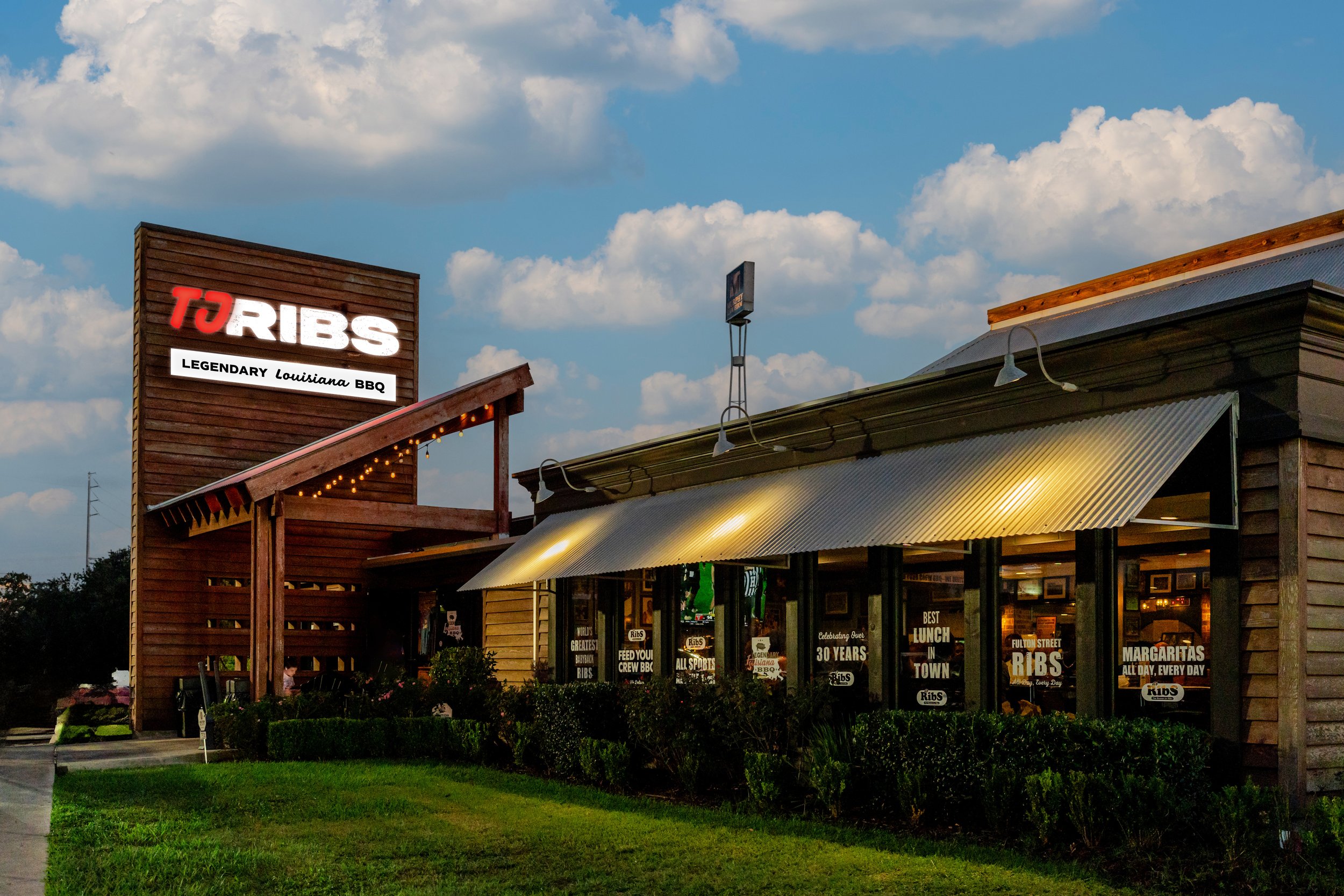
A Baton Rouge original for more than 30 years, TJ Ribs serves fresh seafood, Cajun-inspired comfort food, and a lively game-day atmosphere with lots of sports coverage. For decades, they’ve proudly dished out award-winning baby back ribs with all the fixings to the beloved Baton Rouge community. Located near LSU’s campus, TJ’s is a favorite spot for college students, their families, and sports fans alike—unless you happen to be a rival of the Tigers.
Primary Graphic Designer
Visual Direction for Concept
Illustrator
Project Roles
Concept Designed at Pinckney Harmon
Marketing with the Creative Team
2025
Details
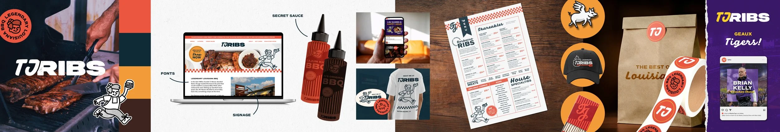
A “stylescape,” gives the client an idea of the general look & feel of a brand concept, often including photography, illustrations, proposed typography, colors, and application mockups that make sense for the brand. Scroll down for a closer look!
I didn’t want this rebrand to feel like a reinvention—I wanted it to feel like a refinement. Something familiar at first glance, so TJ’s long-earned recognition stays intact, but refreshed enough to feel new, current, and flexible. The colors and typography follow the same spirit as the existing brand, just modernized and smoothed out, giving everything a more polished, adaptable feel without losing its roots.
TJ’s has always been a haven for college students and local sports fans, so I leaned into that energy. I wanted the brand to feel a little rugged, a little rowdy—like a true sports-bar sanctuary where game-day watch parties happen often and the food is unapologetically messy and delicious. Its simple, satisfying, and gooooood. The goal for this new look was instant clarity: when out-of-towners and first-time visitors walk in, they should immediately know exactly what kind of experience they’re in for. Legendary Louisiana BBQ, with a side of sports.
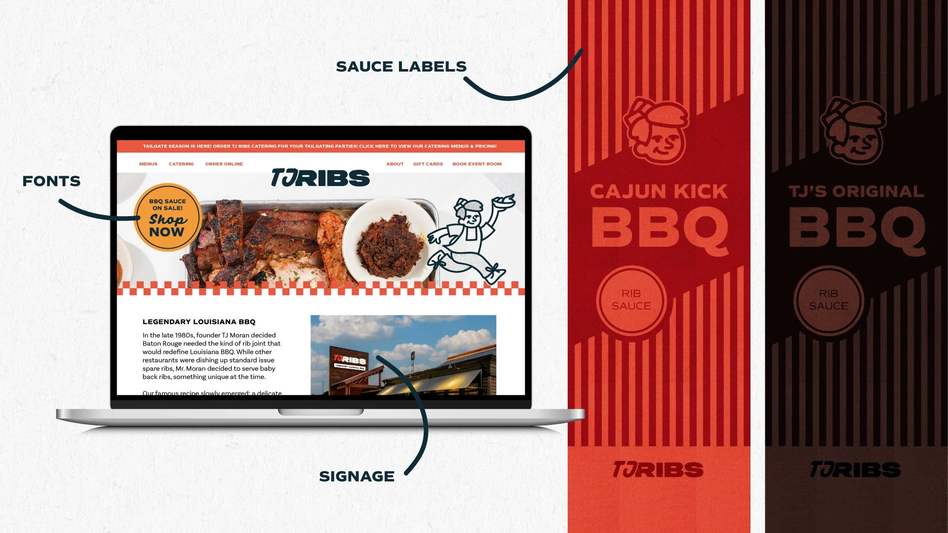
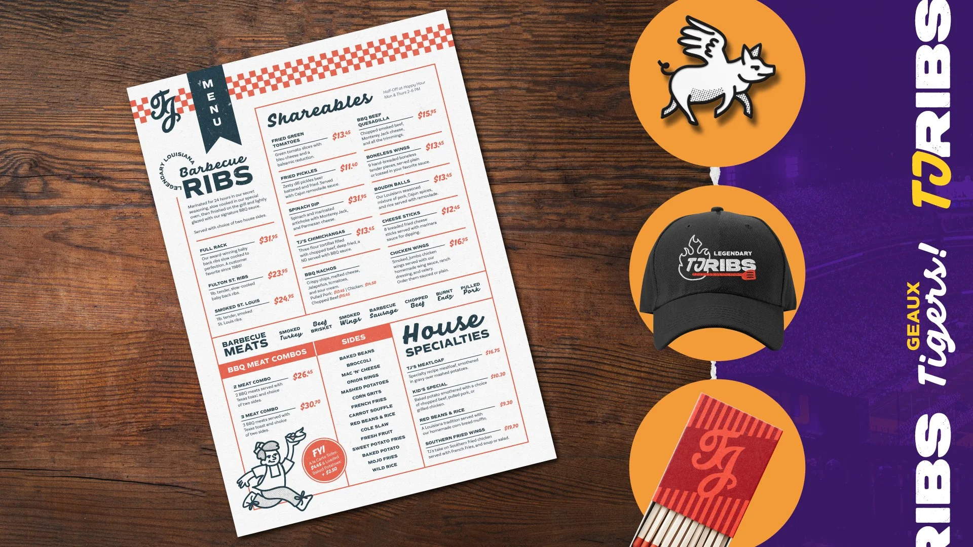
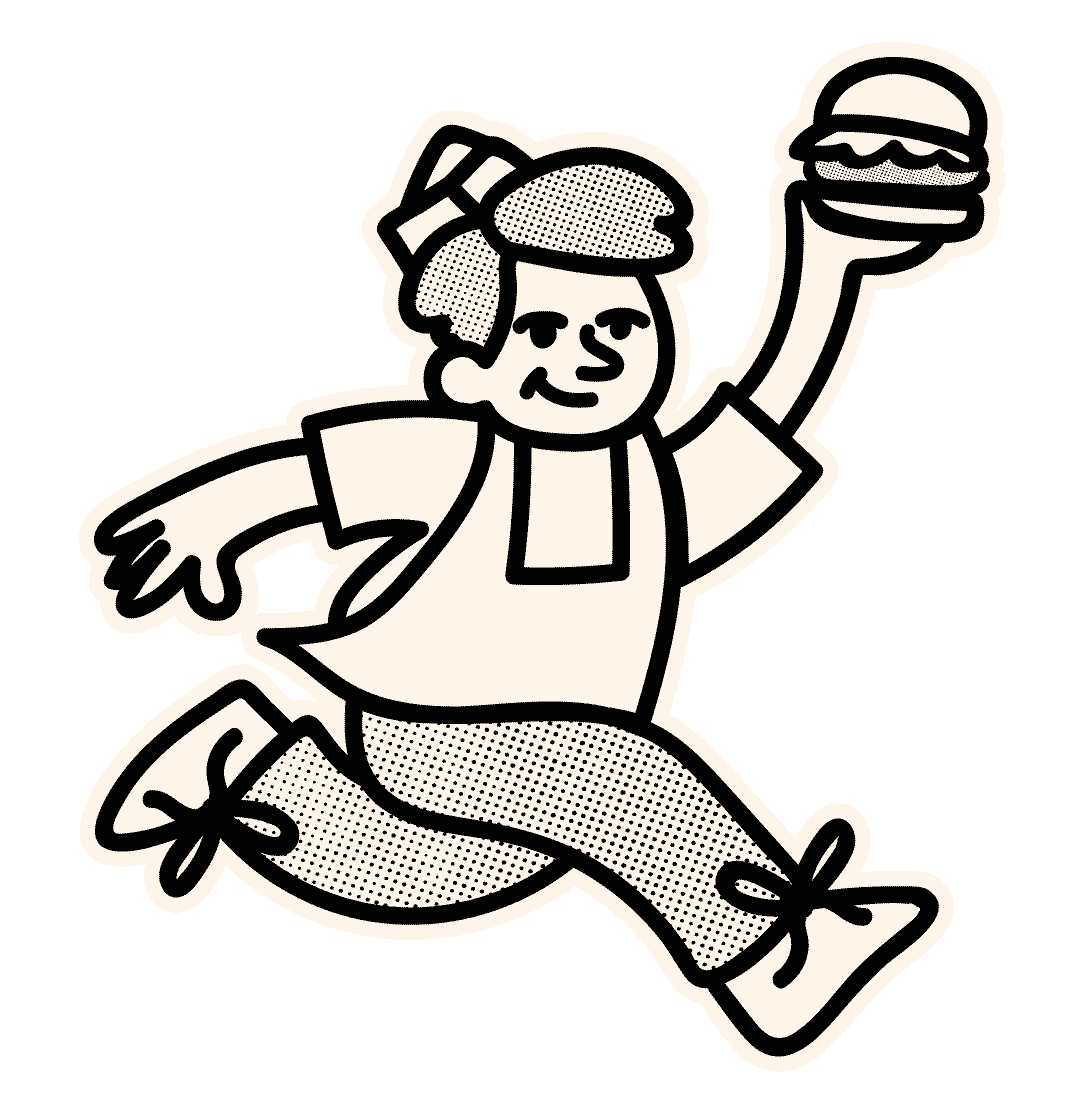
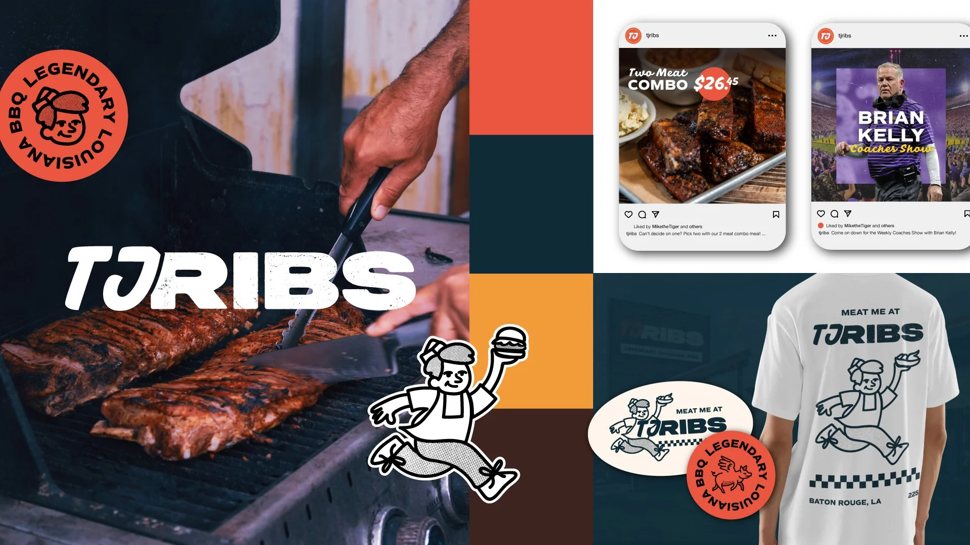
Every great team has a face, so I gave TJ’s one. Enter TJ—the mascot. He ties the brand back to its history and its name, embodying the foundation of what TJ’s is all about: serious BBQ and real-deal Cajun comfort. The current owner shared a retro diner–style sign with a TJ monogram that hangs inside the restaurant, and that detail became a spark. From there, a subtle retro diner influence made its way through the brand, showing up especially in the menu redesign and BBQ sauce label mockups.
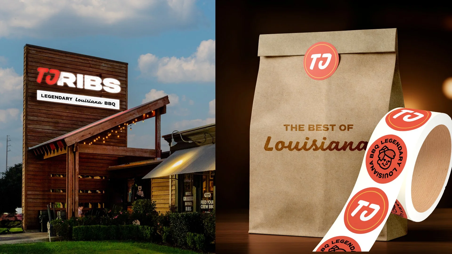
The website follows the same philosophy—no distractions, no guessing. You land, you see ribs first. Then, once your appetite’s hooked, the personality comes through loud and clear. And once the essentials were set, it was time for the best part of brand design: application mockups. TJ’s isn’t just a BBQ joint—it’s a destination. Hats, T-shirts, stickers, enamel pins, matchboxes—little keepsakes that let people take a piece of the experience home with them, long after the plates are cleared.
©2026